What the font?
“WhatTheFont” is a useful tool that helps you to find the font you saw on a website. Just upload an image, click the font you want to identify, then check out the results. Pretty easy and time saving
At fources agency, we love typography. Our graphic designer Lorraine has a passion for books and fonts since forever. She thought that her job would be something with books, but that was before she discovered the web.
Since then, she puts her love for fonts in her designs and takes care of every details in graphic guidelines.
First things first : where to find good fonts?
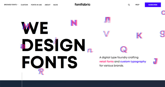
There are famous websites where you can find fonts : DaFont, fontfabric, font squirrel, typekit by Adobe or Google fonts of course. That’s our top 5. Special applause for font squirrel because we can directly upload a font and transform them into a webfont!
You will find all the fonts : classic, fancy, trendy… Make your choice and search alternatives for “overused” fonts as Arial, Helvetica, Times…

Can I use the same font for print and web?
When we have to create an identity for our client, we need to know on which channels he’s going to communicate. Is it only online? Does (s)he have to print a leaflet, book…? You may ask yourself why it’s important for us to have that kind of information…Well, the way people read a book, magazine or flyer is differently than the way we read an article on the web. Some fonts can really be great on a business card or a flyer but terrible on a website. Why?
Print : Serif fonts
Why use them? They make individual letters more distinctive and make the reading easier for the brain. It causes less fatigue.
Web : Sans Serif fonts.
Why use them? When you read something on the internet, texts with serifs are difficult to see but you can always use them with a big size as a title or a graphic element. Our computer screens have a lower resolution which means we can’t compare print and web. So if you want to entertain people with your content on the web, use a Sans Serif font. It will be better.
What makes a font easy to use?
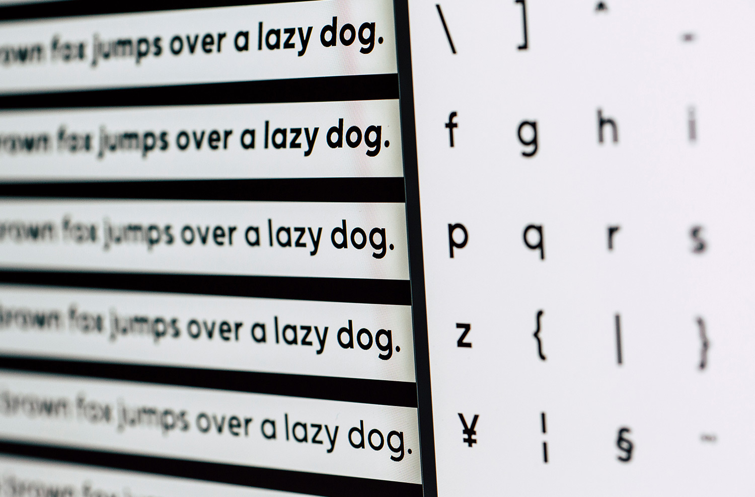
The perfect font for us will be : a complete alphabet with all glyphs (special characters) with a font weight and italic. That’s all what you need to create content. If you don’t have bold or italic already, it will be automatically done and the result may be different than your expectations.
As webdesigners, we have to keep an eye on page speed on your website and sometimes, fancy fonts or fonts that we create are too heavy for the websites. Check that the file or the link is not too heavy/slow to display your content. If it is, optimize it!
I can’t choose between several fonts
And that’s good! Mix and match your fonts! The result will be more than good. Of course, try to respect your identity. No need to use Comic Sans MS. Really…Designers and typographs work hard to create beautiful, graphic, trendy fonts so pick your favourite fonts and make the magic happen.
Don’t use more than 3 different fonts in your identity. Because with more than 3, you’ll lose the logic behind your identity and it will be more difficult for your client to understand who you are.
Shell your font.
Does it work when it’s small? When it’s big? Test your font on every colour/device/paper that you need for your communication. Print what you expect to be printed and test on every browser your online communication. Don’t hesitate to ask people what they think about your fonts. Don’t ask them if they like or not but if your identity matches your choice of fonts.
If you want to create your visual identity or rebrand it, contact us!
Credits : Photo by Markus Spiske on Unsplash


