a few words
NotiX, the innovative healthcare
ABOUT CLIENT :
“Technology driven solutions for the healthcare market”
That’s what notiX is all about.
notiX is a company specialized in innovation & healthcare. One of their key statement is to bring healthcare technology innovation to the patients.
Their goals are very clear :
INNOVATE with healthcare technology to raise quality of care
CREATE specialized healthcare technology solutions
DISTRIBUTE the best in class healthcare technologies
INTEGRATE innovation in healthcare systems
PARTICIPATE in healthcare technology innovation
HOW DID WE HELP THEM :
Before we started searching for a name, we wrote down all the keywords that were important for their business : innovation, healthcare, B2B, global, software, technology, future, quality, efficiency…
All of the keywords resulted in notiX.
Which stands for; innovation, technoloy and new & future ideas.
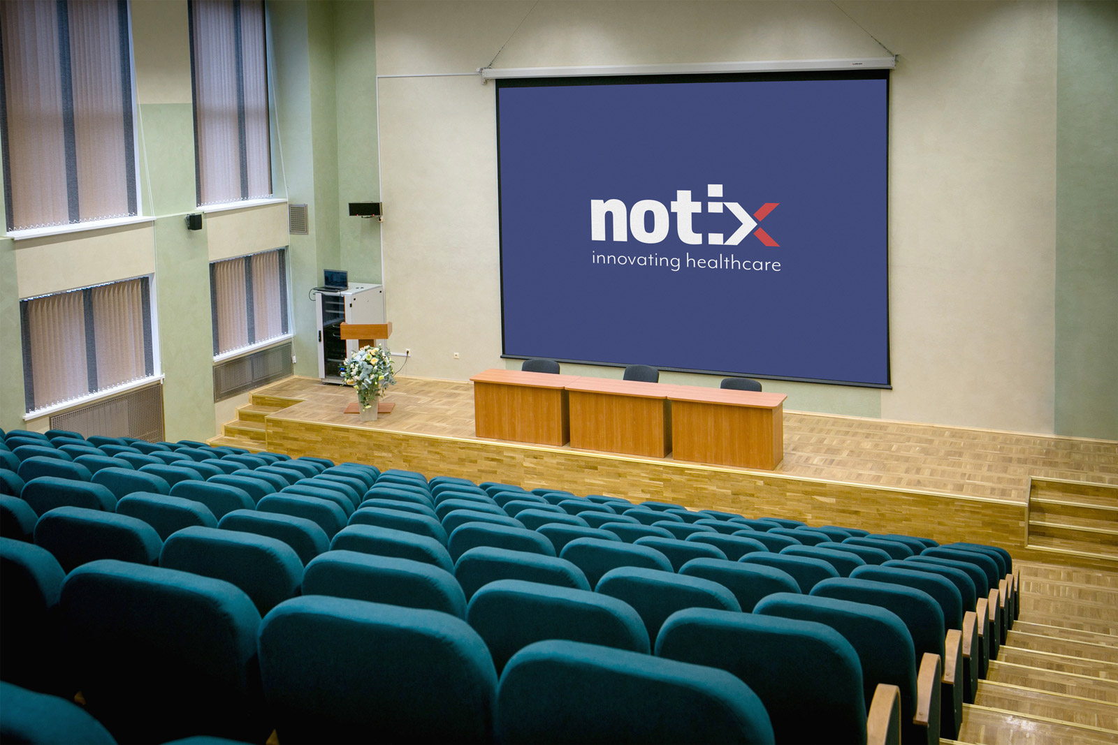
Once we decided on the name, we had to find the right type of logo for notiX. The logo had to be dynamic with a focus on the future. It had to be adjustable and we used reassuring colours for healthcare.
When designing the logo, we focused on the X. The X stands for many things; new ideas, X factor, new things coming. We’ve linked it to the arrow (negative space) because new ideas define the future. The X can also be used as a single symbol in the visual identity.
The arrow stands for going forward, looking to the future, innovating. This is what notiX stands for, going forward.
skills required
design
logo design
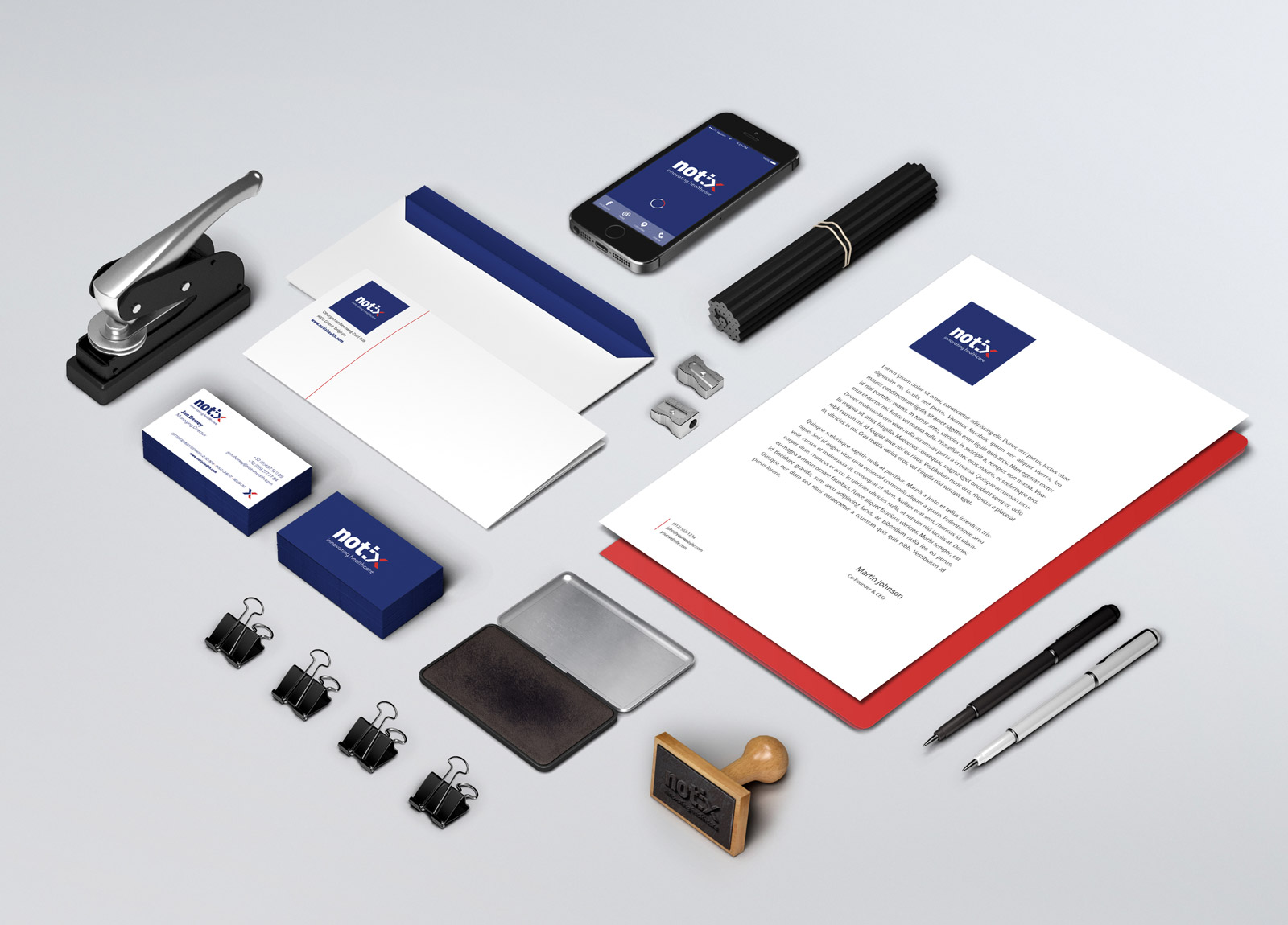
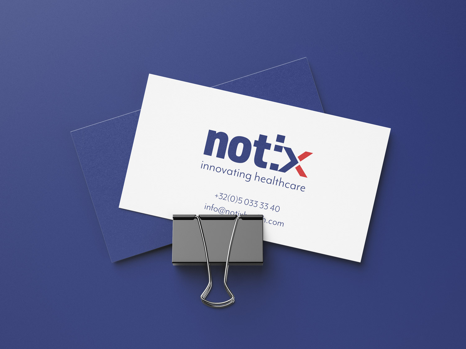
business cards
graphical guidelines


for a project, an idea, a coffee, an internship
Let’s work together
There is always a reason to contact us : an idea, a quote, an internship, a question about your website…